As the Russian painter and art theorist once said, colour is a power that directly influences the soul. Explaining the concept of colours to be used in the home, Interior Designer Smitha Zachariah, Creative Head of ZXP Design, shares her thoughts on popular interior design colour trends.

Colour: a key element of décor
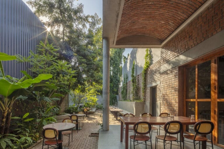
The colours you choose are often a reflection of not only your tastes but your personality as well. Your distinct persona shows up in your home in multiple ways. And you don’t want to change that when you do up your place. But, if you’re going to shake things up a little, retaining the essence of YOU, there are so many ways to do it by shaking up your colour scheme. A lick of paint and some great lighting has the power to change the look and feel of the space, adding new dimensions to your space. The right splash of colour will make your statement décor looks more dramatic; your furniture becomes somehow more resplendent and your rooms airier.
Colour schemes and décor styles
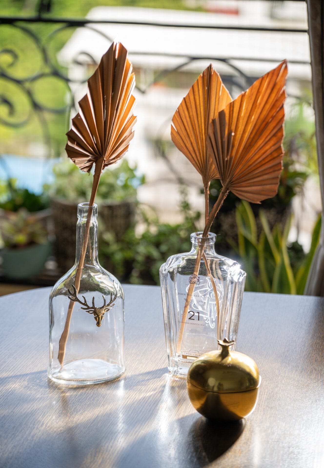
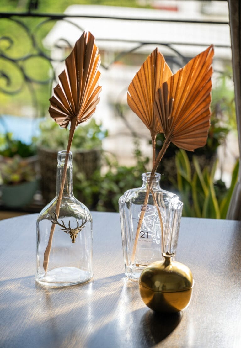
Choose a colour palette of whites and off-whites, pale blue, beige. If ethnic or boho chic is your jam, then warm, happy colours are best for you. Think rust, ochre, burnt orange and yellow. Funnel your inner earth goddess with nutty browns, watery blues and fresh forest greens to nurture your inner earth goddess; choose pastel pinks, dusty rose, lavender, peach and sage green if you like rustic chic and cosy; think neutrals and grey with pops of colours in between if your style is modern farmhouse
Colours and their Connotation
Here is a look at some colours, colour pairings and combinations, and what they signify and reveal about your home and you.
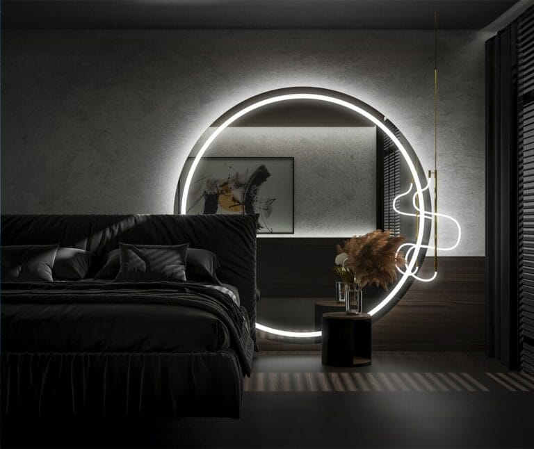
Black and white: Black for efficiency, white for excellence—how can you go wrong with that? A statement of elegance and class, this combination rarely fails, making your house look ultra-chic and adding sophistication, maturity and formality to it. Other perks? It enhances the sense of space, making the room look larger and lighter. And yes, if this is your favourite, you’re probably a meticulous planner who loves attention to detail but is also minimalistic.
Grey and white: Serenity is the first word that comes to mind when one thinks about spaces done up in grey and white. It is all about understated charm and elegance, with some calm, serene vibes thrown in. This one is a classic. And yes, the neutral colours make it easy for you to experiment too. Not surprising that grey is the new beige, isn’t it?
Off white, beige and light pink: Soft, light and feminine–this palette is all about creating a soulful vibe in your house, giving off a dreamy, romantic yet graceful look. Also, intensely comforting. Think jasmine whites, dusty rose and walnut creams—all that you need to nail your rustic chic or cottage core aesthetic.
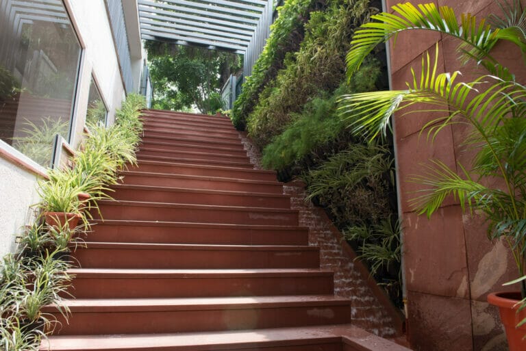
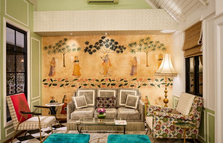
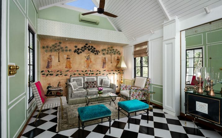
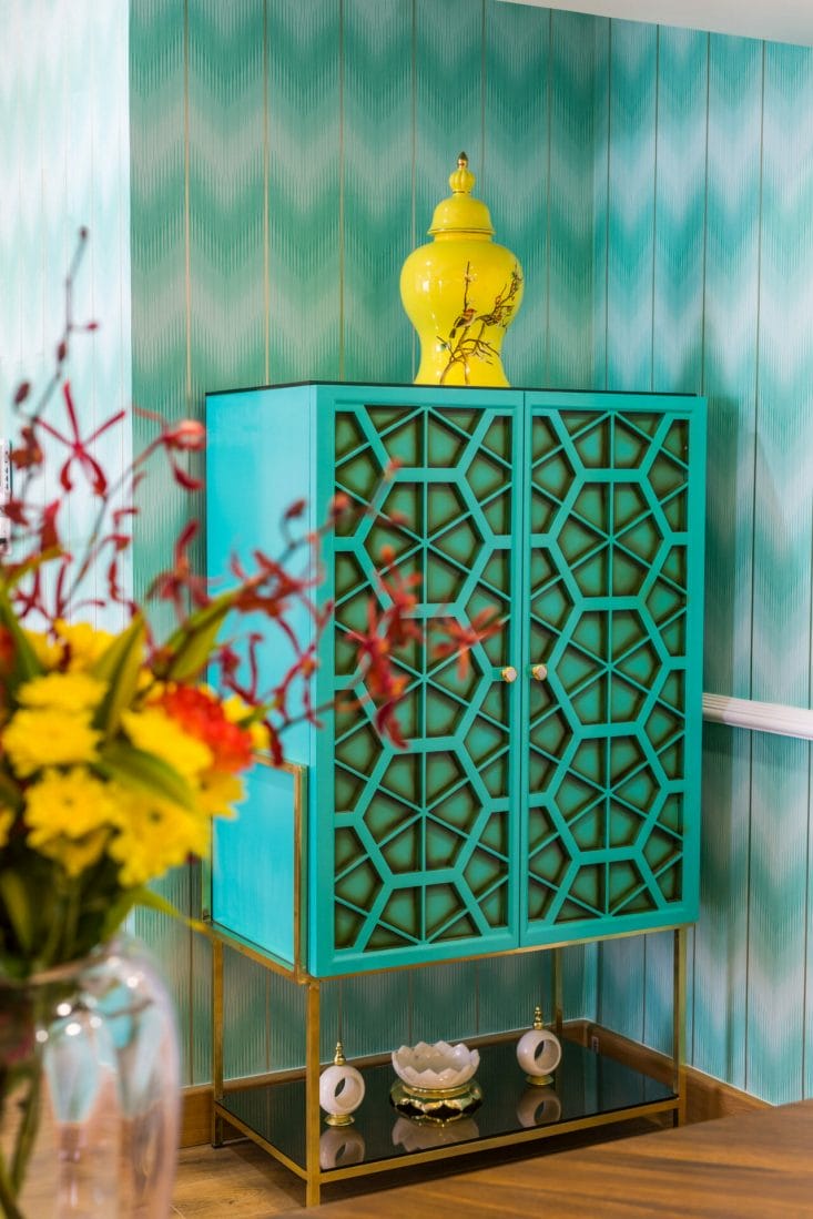
Aqua blue and green: Another classic—think forests, water, a blue sky, the scurry of insects, the soft rustle on an evening breeze–these calm, soothing colours create a sense of tranquillity in any space. It reflects a love for nature and a home that is earthy chic with a focus on sustainability. It is the sort of space you want to return to when your soul is weary, the natural, light, breezy vibes anchoring you to the centre of a space, creating an emotional recharge.
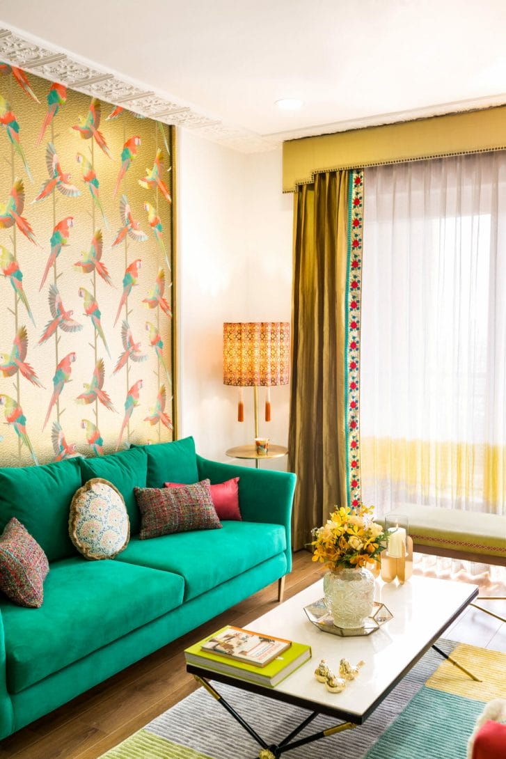
Lime green, turquoise and purple: If you’re a dazzler, you’ll love for your home to be one too. Choose these jewel tones, glamorous and yet, inviting. If you’re someone who prefers your space to be bold, unconventional and a conversation starter, this is the colour scheme for you.
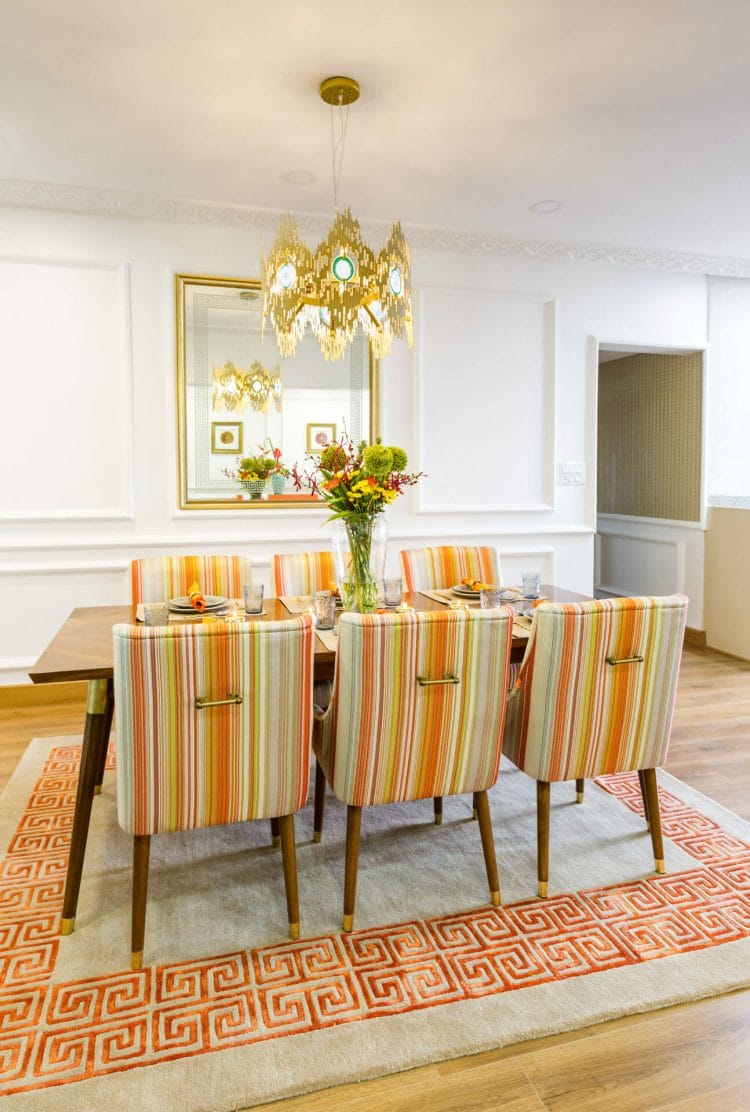
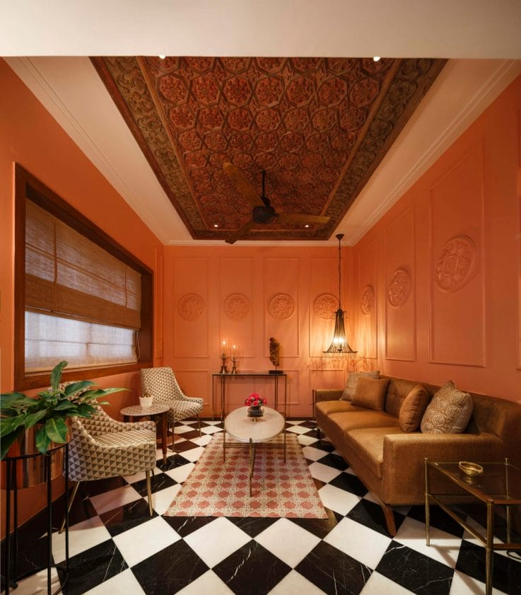
Yellow and Orange: These citrussy shades will help you radiate sunshine even on a dull, dreary day. After all, how long can you stay gloomy when you’re coming home to oodles of freshness, zest and energy. Harmony, balance, sunshine and warmth—you’ll get all this when these are the colours filling your home.
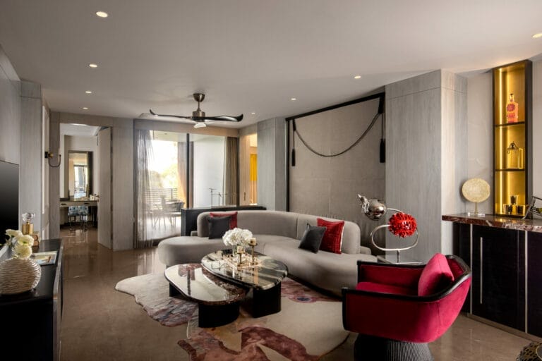
Red and Pink: You don’t play safe, do you? Here’s a mix of decidedly bacchanal shades, evoking images of fine wine, heady passion, and lush living. If you are someone who loves to experiment and not play safe, experiment with these colours to bring in an element of eccentricity and surprise in your space.
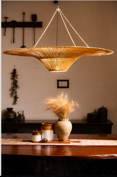
But these are just hints, mind you. The options, as far as colour is concerned, are endless. A new piece of furniture, silk lampshades, flowers, books—they all lend life and personality to your space, reflecting who you are. So, go ahead and live the colour.